In 2018 I attended an immersive course at Mastertech to help me upgrade my skills toolkit and get my hands on new problems. For eight weeks, twice a week, I got myself immersed in the marvellous world of user experience learning and testing methods, shaping skills and also, having lots of fun.
The Problem
After the first introductory week, we had to decide which problem to solve, but instead of trying to save the world, my group and I aimed for something different yet still important and also joyful: help musicians and music learners to improve, more specifically, guitar players.
How to create a network of accurate and reliable guitar chords and tablatures with an optimised tracking system to help self-taught musicians?
The Question
The first step was the classical question: HOW?
My former group colleagues were Rafael and Wellington, who had the same taste for music as I am — actually Rafa is a prodigy — so we had a good team to embrace the challenge that already empathised with it.
First, we started shooting out ideas and worked on a mind-map to clarify and organise our thoughts.
Our purpose was to solve a music-related problem and we managed to identify what were the mains subjects that we should focus on:
• Education: many guitar players are self-learners and need a solution that provides a way to access information and classes, those who already know how to play the instrument wants to learn and practice new songs.
• Accurate Information: there are a lot of places to go for information, but are they accurate and verified by established musicians?
• Accessibility: the solution should be available whenever the user wants or need.
• Tablatures: the most spread and simplified way of reading music. The user should be able to access a searchable database with validated information.
One of the good things about organising the information in mind-maps was that we found co-relations between the subjects and learn the importance of them.
The answer
The internet is the main source of information for almost every matter, but there are better and quickest ways of learning how to play the guitar and perform songs: tablatures and chords catalogue apps.
Research
We had a problem well defined and the solution was in our mind — and on paper too — so it was time to put our hands to work. A competitors analysis was conducted in order to see who were the big players in the market and how their solutions work.
After selecting 4 different apps we analysed the principal features that were more relevant to the overall experience and graded them in a binary system to keep the results more easy to see.
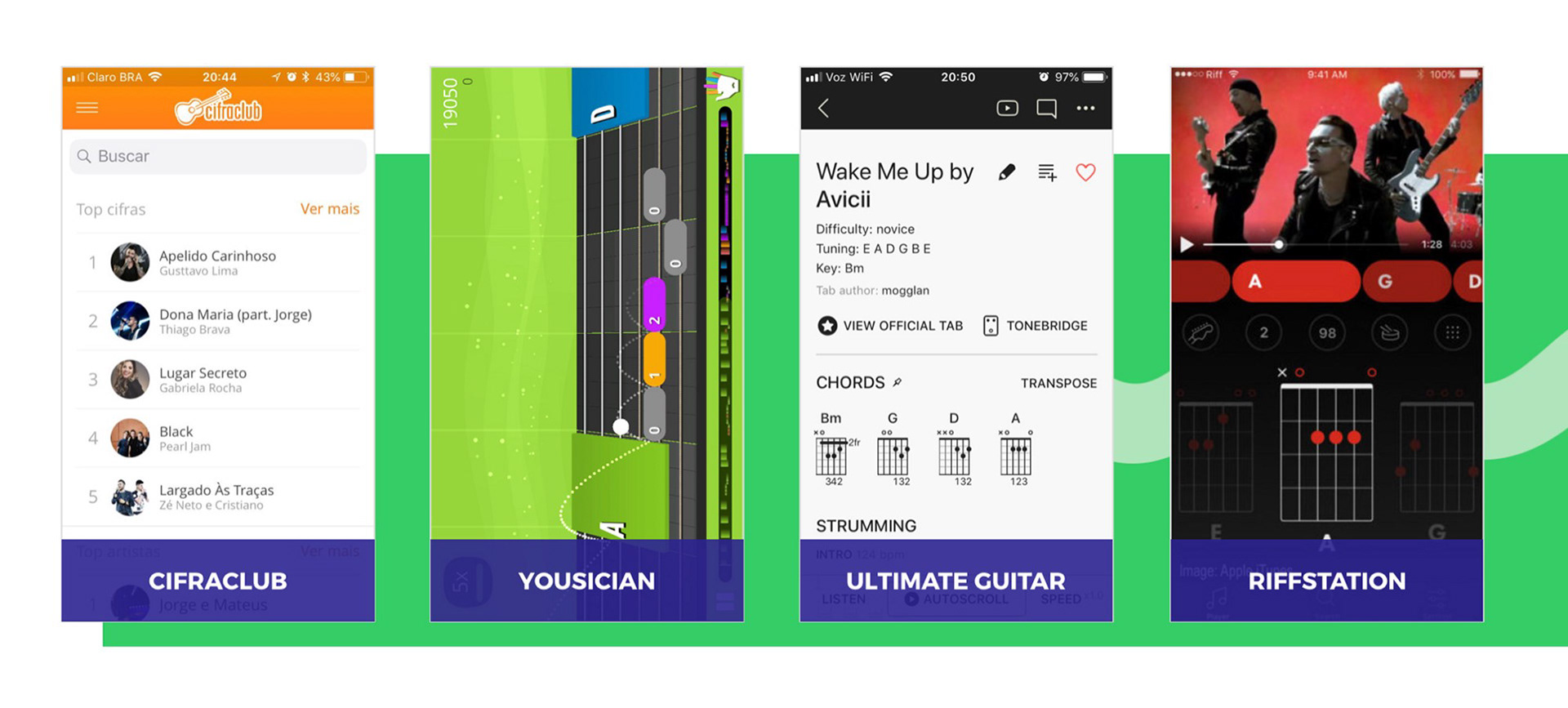
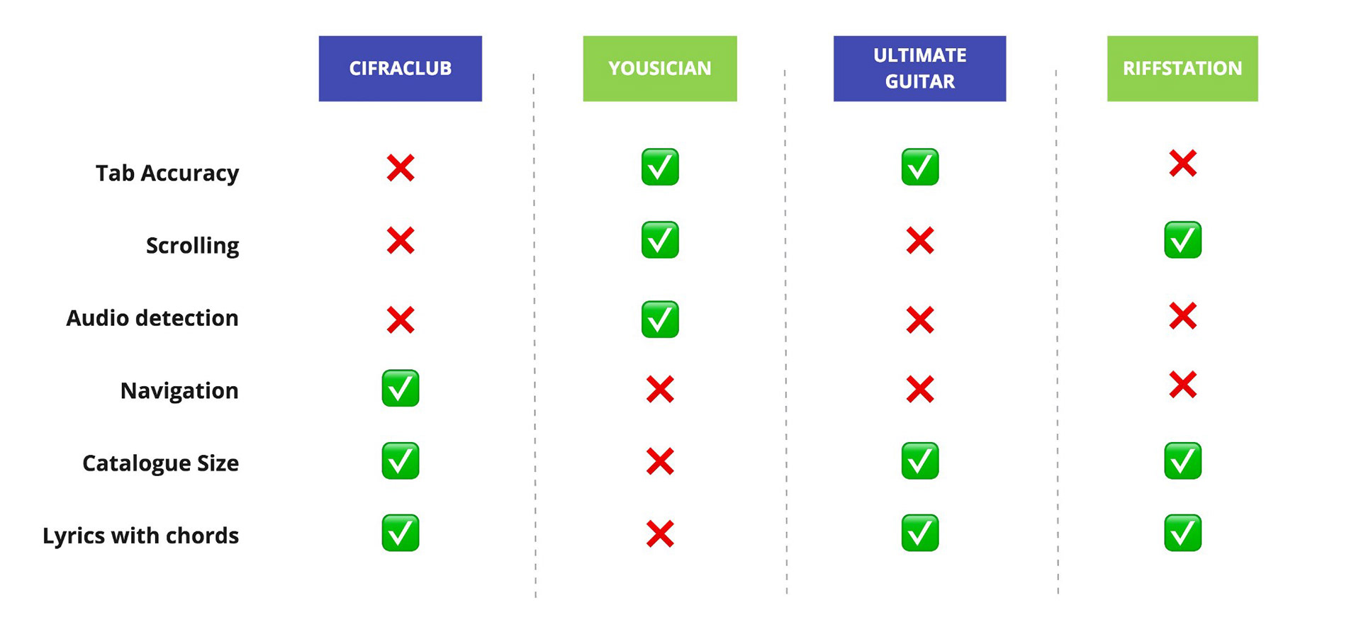
With the results in hand, we had an equation to start designing our solution: the best features of the best solutions + improvements on tabs accuracy + a new auto-follow feature.
“Stop trying to reinvent the wheel
and you’ll have more time and energy
to design a spaceship.”
and you’ll have more time and energy
to design a spaceship.”
User Personas
As we were working on this project as a subject of study in the UX/UI Immersive Course and didn’t have too much time to spend because we had a lot more content coming over the classes, it wasn’t possible to make a proper research.
For this motive, we created 3 proto-personas which have different levels of skills as guitar players and different needs.
Therefore, we decided to focus on the persona that would be using the higher amount of features of the app which allowed us to understand the main characteristics and particularities of the audience.
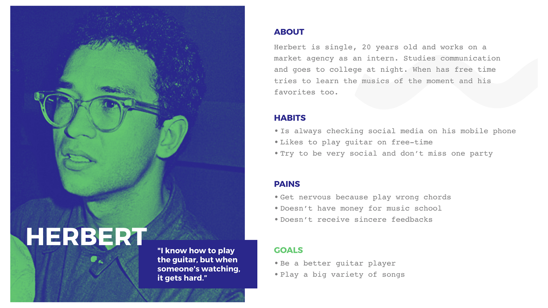
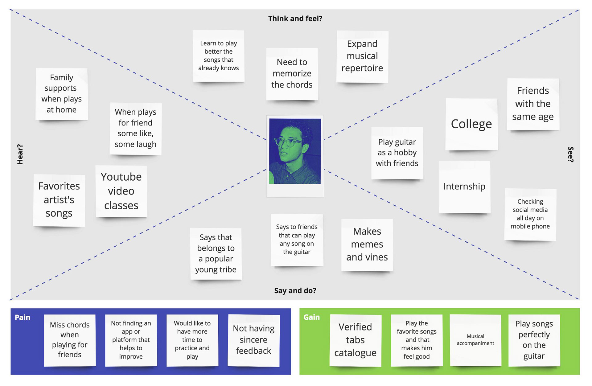
With the proto-persona defined, we described the internal and external actions, expectations and feelings of the user in order to map out his journey on learning how to play a new song. This process helped us to decide how
the experience might be designed to satisfy his needs and desires while
using the app.
the experience might be designed to satisfy his needs and desires while
using the app.
Sketching
Using agile methods and crazy 8’s we started to sketch the first screens and the main features of the product.
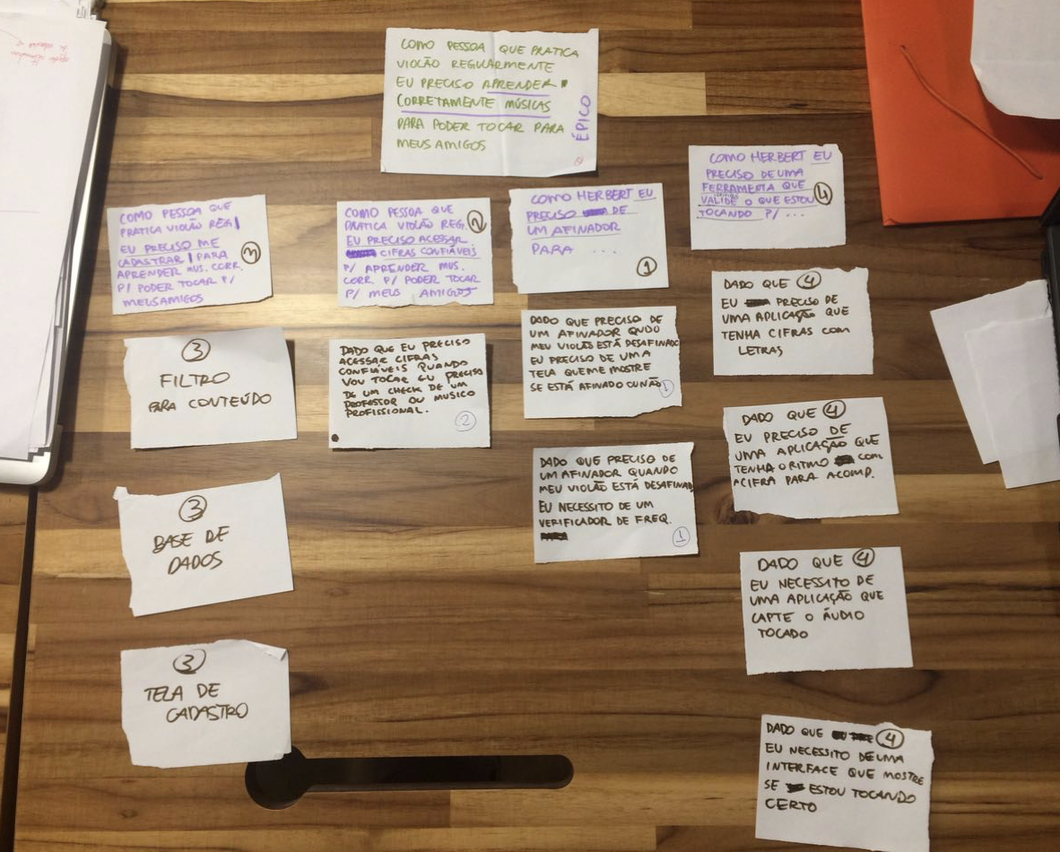
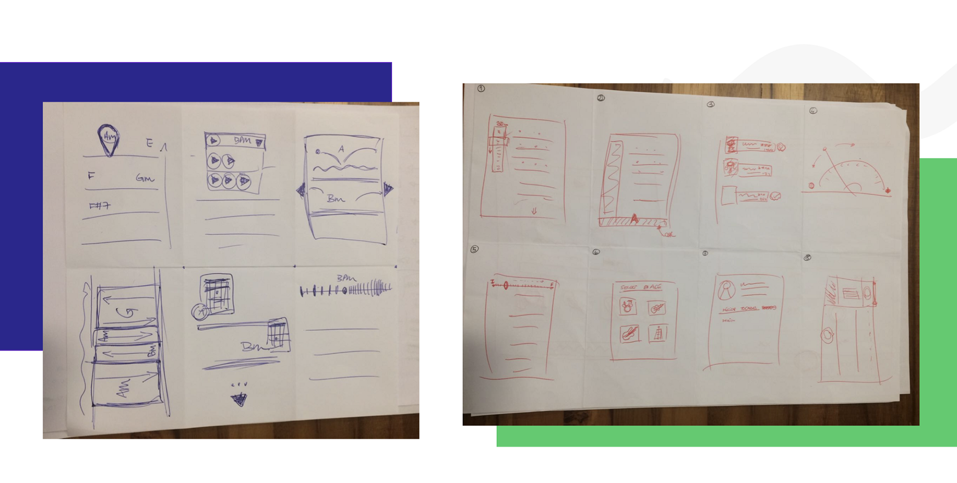
With this in hand, we realised that before starting to wireframe a prototype we needed to have a well-defined user flow. Mapping the basic flow of the app helped to figure each step on the path the users will take when using the product.
Our solution had some features that made the solution different from the others in the market and drawing the flows we made clear in which stage they should appear.
Skill Level
The users should have a tailored experience based on their skill level as musicians. After selecting their instrument and preferred music genre they would select their skill level: if they are beginners, the app would show simplified tabs first and suggest songbooks with easy chords so they can practice and learn with confidence. The complexity of the tablatures would progressively increase once they became intermediate users and then experts. The skill level could be changed at any time or more difficult songs could be selected as pleased and also the app would keep a history of songs clicked over the time to measure skill evolution.
The users should have a tailored experience based on their skill level as musicians. After selecting their instrument and preferred music genre they would select their skill level: if they are beginners, the app would show simplified tabs first and suggest songbooks with easy chords so they can practice and learn with confidence. The complexity of the tablatures would progressively increase once they became intermediate users and then experts. The skill level could be changed at any time or more difficult songs could be selected as pleased and also the app would keep a history of songs clicked over the time to measure skill evolution.
Musical Accompaniment
This unique feature would let users select a musical accompaniment to help them to keep track of the rhythm. Learning can be hard sometimes and is nice to have some help and guidance over the process. A total of four options would be available to be played with the songs: drums, piano, bass guitar and a metronome.
This unique feature would let users select a musical accompaniment to help them to keep track of the rhythm. Learning can be hard sometimes and is nice to have some help and guidance over the process. A total of four options would be available to be played with the songs: drums, piano, bass guitar and a metronome.
“Karaoke Chords”
Another feature designed in order to help the user play the songs correctly would be a karaoke-style visual accompaniment, where the song lyrics would be highlighted following the rhythm of the song. We decided that for this functionality to work well, the app should have a dark theme where the contrast would be noticed easier allowing a better reading.
Another feature designed in order to help the user play the songs correctly would be a karaoke-style visual accompaniment, where the song lyrics would be highlighted following the rhythm of the song. We decided that for this functionality to work well, the app should have a dark theme where the contrast would be noticed easier allowing a better reading.
Wireframing
I picked the sketches we made in paper and started to design the wireframes focusing on the functionality rather than what it would look like — first things first, right?
Moreover, the simplicity of wireframes allowed us to quickly test ideas without going deep into the visual details.
Then we created a navigable prototype of the wireframes on MarvelApp to ensure that the user flow was followed correctly and having the first feeling of using the app.
Branding
After the wireframing was done, it came the time to give (even) more life and some colour to our work.
Music is energy and movement, right? So, in order to follow these two mains pillars and stand out of the sameness, we looked for references with vibrant and trendy colours.
To get the attention of our target audience — young and modern users — we chose to use contrasting colours and a mixture of gradients and solid patterns with two sans-serif typographies with lots of power and personality.
Summing up the concept of the product, I designed a logo that could easily translate what the app was about with an obvious name and shape that mimics a guitar pluck in movement. The waves of the “m letter” were duplicated to add even more movement to the logo mimicking the guitar strings’ movement.
strum
/strʌm/
/strʌm/
verb
1.play (a guitar or similar instrument) by sweeping the thumb
or a plectrum up or down across the strings.
1.play (a guitar or similar instrument) by sweeping the thumb
or a plectrum up or down across the strings.
noun
1. a sound made by strumming a guitar or similar instrument.
1. a sound made by strumming a guitar or similar instrument.
Prototyping
After completing all the previous steps, the time has come to shape the app through the construction of the screens and navigation in high-fidelity during the last two classes of the course.
At the time of prototyping, some elements were added in order to improve navigation and design but the flows we sketched at start remained the same.
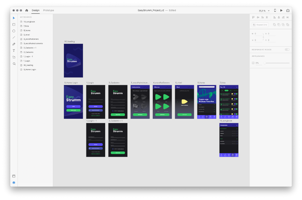
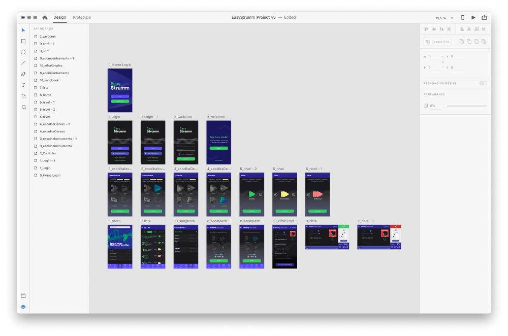
The evolution of the prototype from versions 1 to 5 on the Adobe XD.
Click here to run the navigable prototype
Click here to run the navigable prototype
Conclusions
As for the project, we felt that we could go much more deeply into the screens, usability and animations, but the clock was ticking. Unfortunately, we did not have time and resources to run usability tests at the moment but, as it was a study project, we got satisfied with the solution we ended with.
At the end of the course we had the "pitch day" and got very happy with all the compliments received from our colleagues after our presentation and some of the teachers said that we should continue with the project and scale it to an MVP due to the quality of the project.
After all the sketches and personas, graphs and maps, iterations and redesigns, personally, I got the feeling of accomplished mission.
I gained a lot of knowledge in the UX field and achieved my objective from when I enrolled in the course: opening my eyes and spreading my wings towards all the abilities that a complete UX Designer should have — even though I believe in T-shaped professionals.
And if you stayed tuned until this very end, thank you for reading =)
